Optimize Your Website to Attract More Customers
(Without Starting From Scratch)
*This post may contain affiliate links to products I recommend. I may earn a small commission when you click on the links or make a purchase, this is at no additional cost to you. Thanks!
Your website shouldn’t just exist. It should be a website to attract more customers and actually work for you—bringing in leads, building trust, and making your business feel like a no-brainer to work with.
But if your site’s been sitting quietly in the background (or worse—gathering dust), don’t worry. You’re not alone. Most service providers I work with already have a website… it’s just not doing much to attract more customers.
The good news? You don’t have to start over or learn a bunch of tech. Let’s walk through a few simple, strategic updates that can turn your website into the lead-generating asset it was meant to be.

Key Takeaways
A great website isn’t just pretty—it’s strategic and built to attract more of the right people
Clear messaging and easy navigation are more important than having tons of content
Your website should guide visitors toward action (not leave them guessing)
A little personality and proof go a long way in building trust
SEO doesn’t have to be scary—just start with the basics
If your site isn’t getting leads, it’s okay to pivot. You deserve a site that supports your growth

Is Your Website Doing Its Job?
A website can look good and still fall flat. If you’re not getting the traffic, leads, or inquiries you expected, it doesn’t always mean you need to start from scratch—but it does mean something’s not working as well as it could.
Let’s break down five simple shifts that can help your website attract more customers—by bringing in the right people, building trust, and guiding them to take action.
Clarity Comes First—Not More Content
When a potential client lands on your website, they’re asking one thing:
“Am I in the right place?”
If your site doesn’t answer that within 5 seconds, they’re gone.
Here’s what to check:
Is it clear what you do, who you help, and how you help them?
Can they easily tell how to take the next step?
Are your headlines and calls to action written in their language (not just industry jargon)?
✨ Tip: Less is more when it’s strategic. Clarity converts better than clutter every time. Check out my blog on must-have pages for your website for more details.
Not sure what content to include? Ask yourself: What are the most important things my potential clients need to know before deciding to work with me?
That list becomes your guide. Your website should answer their questions, ease their concerns, and help them feel confident taking the next step.
Make It Easy to Take the Next Step
A website that attracts more customers guides people, not just informs them.
You want to make it ridiculously easy to:
Book a call
Send a message
Get more info on your services
Whether it’s a button, form, scheduler, or all three, your CTAs should feel clear, helpful, and easy to spot. If they have to hunt for it, they won’t do it.
✨ Think of your website like a friendly guide—always pointing them toward the next step.
And here’s the key: You should have one main goal for your visitors.
Maybe it’s to book a call, join your email list, or schedule an appointment. Whatever that main action is, most of your CTAs should guide people there.
You can offer other options, but if everything is emphasized equally, visitors won’t know what to do next. Clarity creates confidence (and conversions).
Let Your Personality (and Proof) Do Some Heavy Lifting
Whether you offer classes, services, experiences, or in-home support, people want to feel like they’re hiring someone they can trust.
Your website is often the first impression, so it needs to show both what you do and who you are in a clear, approachable way.
This is where the Know, Like, and Trust factor comes in:
They need to know who you are and what you offer
Like how you present yourself and your business
And trust that you’re the right person (or team) to help them
That means your site should include:
A friendly, clear bio or about section
Testimonials or reviews that reflect real results or happy customers
A sense of personality (without oversharing) - Your website visitors don’t need to know what your favorite coffee drink is unless maybe you’re selling coffee!
✨ People don’t just choose the most qualified—they choose the most relatable, clear, and trustworthy option. Your website can help make that choice easy.
Use Simple SEO So the Right People Can Find You
You don’t need to be an SEO expert—but your website should make it easy for people to find you when they’re searching for the kind of help you offer.
Start by using clear, specific words your potential clients would actually type into Google. Think:
What are they searching for when they need support?
What phrases would they use to describe your service?
Use those words naturally in your page titles, section headings, and image descriptions.
A few more SEO tips:
Add alt text to your images (that’s just a short description that helps with both accessibility and search visibility)
Give each page a clear purpose—don’t try to cram everything onto one page.
Use headings to break up your content and guide both visitors and search engines
✨ Every site I design includes these foundational, search-friendly practices—so you’re already set up for growth, even if SEO isn’t your focus right now.
Does Your Website Still Reflect Your Business?
If your site was built a few years ago—or even just a few big changes ago—it might not be telling the full story of your business today.
Ask yourself:
Have your service offerings changed, but your site still lists the old ones?
Have your prices increased, but your website still shows outdated rates?
Have you shifted your focus to a new audience, but your messaging still speaks to an older one?
Your website should match what you offer, who you serve, and the kind of experience you deliver. If it doesn’t, visitors may get the wrong idea—or bounce before they even reach out.
And it’s not just about words. Visuals matter, too. Your design should align with the expectations of your industry.
A few examples:
A business that works with children (like a pediatric therapist or family-focused service) might use bright colors, fun fonts, and playful photos
A wellness brand or spa is better suited to muted tones, elegant fonts, and calming imagery
A sailing charter or outdoor adventure service might lean into bold visuals, nature-focused photography, and crisp, modern text
✨ Your brand’s look, feel, and message should all work together to attract the right clients—and help them feel confident they’re in the right place. Not sure if you’re on brand? Book a website audit to get an expert opinion.
Final Thoughts On Optimizing your Website to Attract More customers
You don’t need a flashy website. You need a clear, strategic one that actually supports your business.
If your site feels out of sync, that’s not a failure—it’s just a sign that your business has grown. And that’s a good thing.
Small, thoughtful changes can go a long way in helping your website do its job: attracting the right people and making it easy for them to work with you.
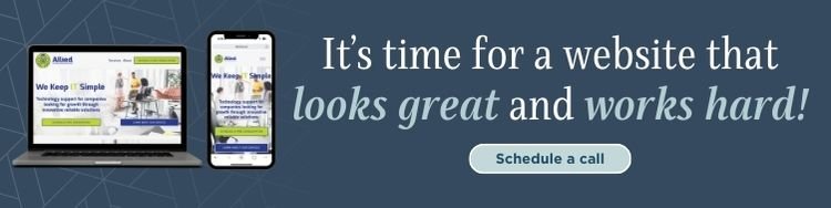
Let’s Make Your Website Work for Your Business
A well-designed website does more than look good—it works behind the scenes 24/7 to:
Build trust with potential clients
Clearly communicate what you offer
Help people take action without second-guessing
Save you time by doing the heavy lifting upfront
If your current site isn’t doing that, it might be time for a refresh—or at least a solid strategy check.
I’d love to help you get there. If you're ready for a website to attract more customers—or just want to know what’s holding your current one back—let’s talk it through and find the right path forward.
💬 Feel free to reach out or book a free discovery call—we’ll figure it out together.
FAQs
-
If your site isn’t bringing in leads, feels outdated, or doesn’t match your current services or brand—you’re probably due for a tune-up. Even small updates can make a big difference in optimizing your website to attract more customers and help visitors take action.
-
Not always. Sometimes, a few strategic tweaks—like updating your messaging, streamlining your layout, or adjusting calls to action—can get your site working harder for you. A professional audit is a great way to get clarity on what to fix (and what’s already working).
-
If “good enough” isn’t bringing in the right clients, it might be time for a second set of eyes. Many DIY sites look fine on the surface but fall short when it comes to structure, clarity, or conversion. That’s where strategy comes in.
-
While I specialize in Squarespace, I often work with clients who are migrating from other platforms. If you’re open to switching, I can help guide you through it—and make sure the new site feels like a true upgrade.
-
Start with a free discovery call. We’ll talk through your goals, what’s working (and what’s not), and I’ll help you figure out the best next step—whether that’s a full project, a one-page site, or just a website audit to start.